CLIENT
SALIDO
INTERFACE DESIGN • USER EXPERIENCE DESIGN • PRODUCT STRATEGY
Running a restaurant is difficult in this day and age. In order to give customers the best experience, technology is powering a large portion of daily operations. Unfortunately, much of today’s restaurant tech doesn’t talk to each other very well. The tech stack has to maximize efficiency in order for a restaurant to maximize sales and without all of those parts working together, even a small lunch rush can become an operators worst nightmare.
SALIDO is a new age hospitality tech company aiming to make sure that the software powering restaurants is driving profitability by building an end-to-end solution. Their restaurant operating system allows operators to share data across all of their products in SALIDO’s suite of services. This gives the customer a more personal dining experience and allows management to really understand what’s happening across the board.
THE BACKGROUND
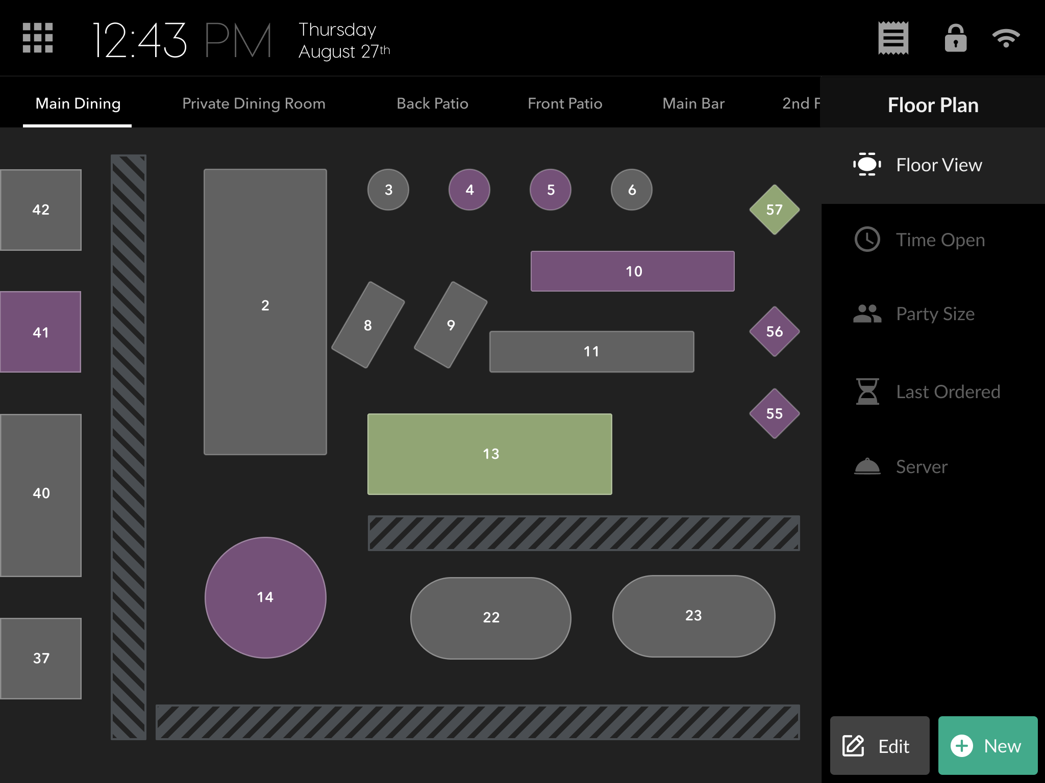
SALIDO’s leading products include their sleek and easy-to-use Point of Sale System(POS) along with their powerful Operations(Ops) Dashboard. The level of flexibility and operation-level customization it allows makes the product difficult to compete with. But while they are a top selling solution for new customers, current user research consistently unveils clear improvements needed to speed up customer workflows. This research ranges anywhere menu placement variations to changes in button sizes.
The team at SALIDO reached out to me for two reasons. They wanted to first, improve the Point of Sale experience by polishing the user interface using industry best practices. It was clear there were multiple style guides being used across the product and they believed a more systematic approach to the redesign was the way guarantee success. Additionally they wanted to completely revamp the web-based Ops Dashboard. While it gave managers a lot of flexibility with its powerful toolset, it lacked a consistent user experience without a global design system policing feature development.
DIGGING IN
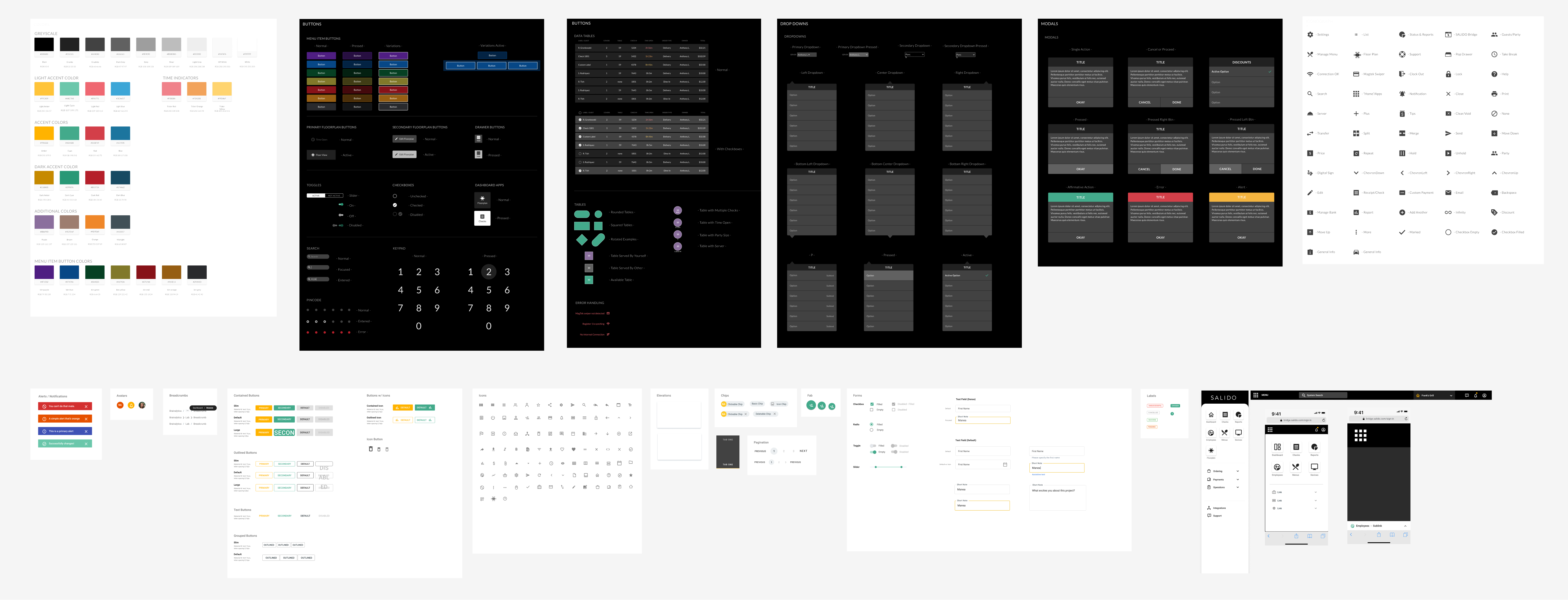
To start, An underlying issue that would continue to affect the product suite from top to bottom was the lack of a documented design guidance informing decisions. SALIDO needed a design system to be the source of truth informing every piece of UI work. They have multiple products on the market and the consistency issue would only grow over time. I worked with the SALIDO product team to build a web and mobile based design system that unified the product styles and language and brought more structure to the feature development process.
It’s important to note that a big part of this design system build also including a new process to work with engineers for creative pass off. Success was defined by not only getting assets centrally located but also by streamlining the design and development workflow of the SALIDO team.
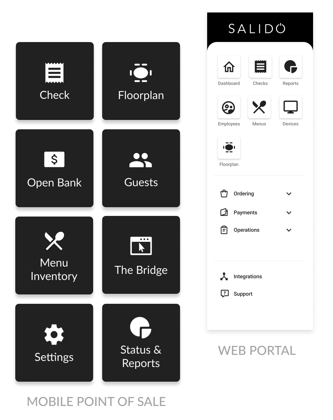
The next step was optimizing platform wide navigations. The nav is a global component you’ll constantly interact with and when you have multiple products in the market meant to talk to each other, they need to have a sense of alignment. Until this point much of the mobile POS and Ops Dashboard did not share consistent components, specifically in the navigation. Icons and language that served similar purposes didn’t match and frustrations would only grow the longer it continued.
I drafted new iconography that better suited the appropriate categories and extended that creative across all navigation components in the product suite.
.
CORE CHALLENGES
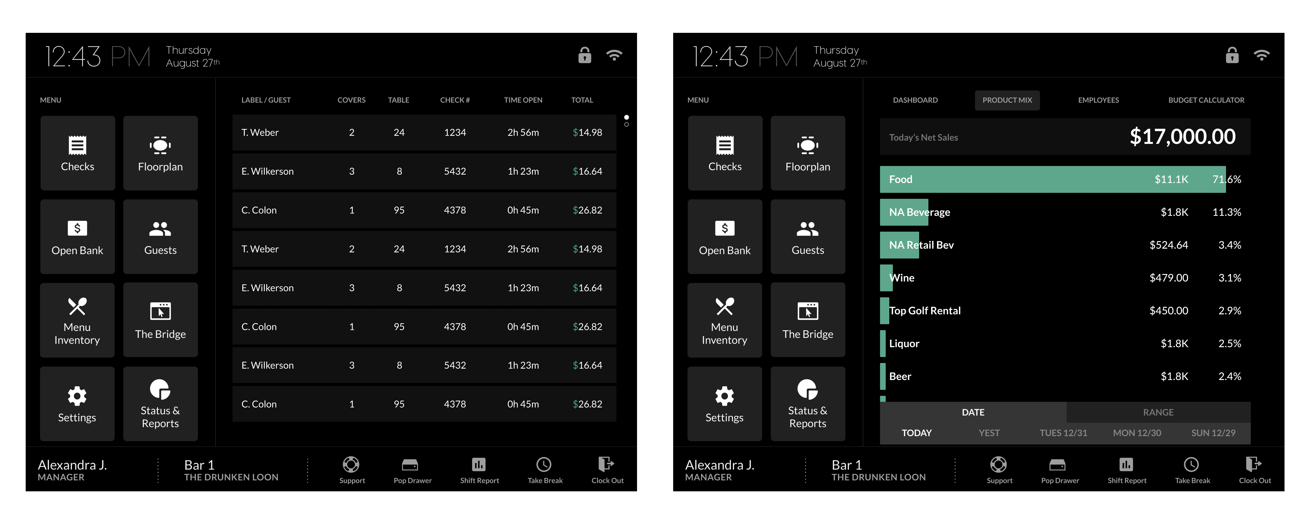
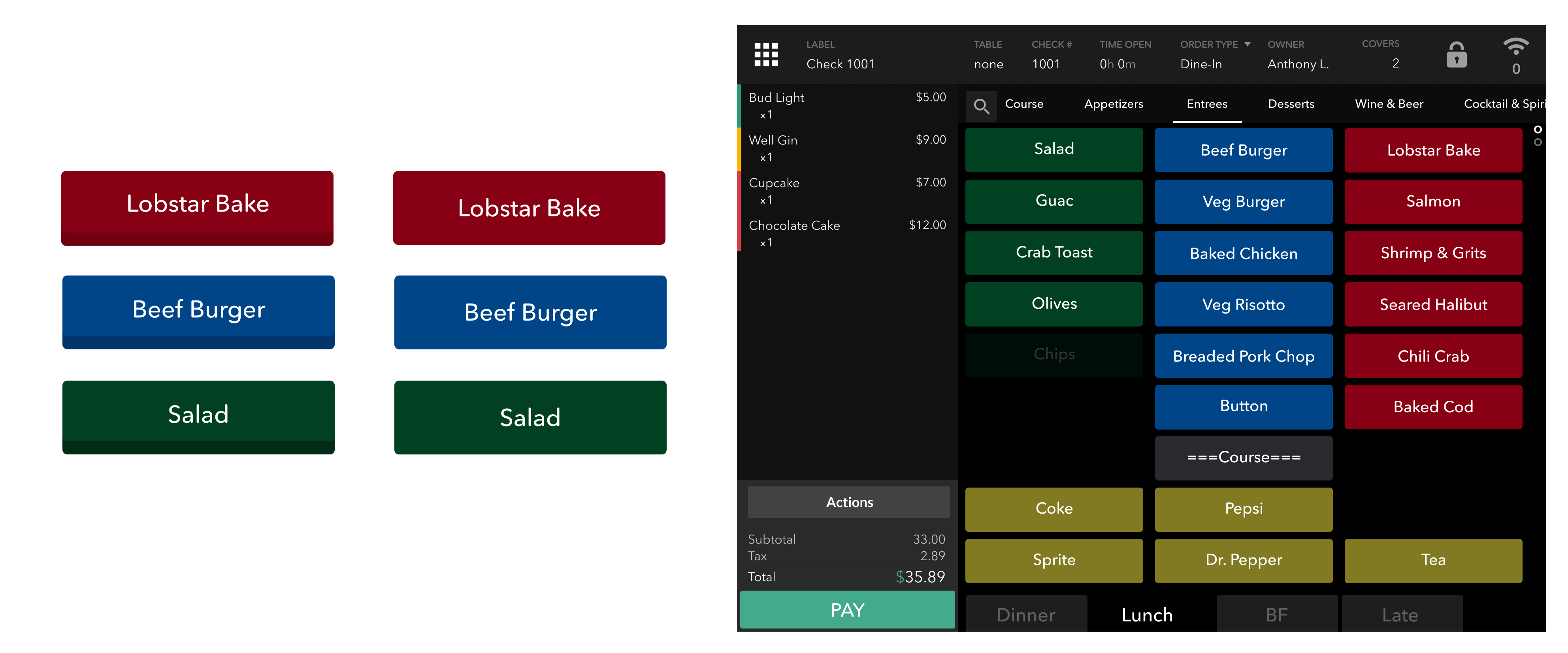
When moving onto more core design challenges the importance of maximizing the clickable space for primary and secondary call-to-actions became clear. Having a strong UX background in these customer workflows, the group knew peak operating hours will force decisions to be made quickly. This includes ordering and payment operations done by waiting staff. Things like sending a table order to the kitchen or closing out a check are done in an average of 2-5 seconds so there isn’t much time for error.
While facilitating one of my research sessions I analyzed call-to-actions that included two-toned 3D styling at the bottom of POS buttons. I tested whether staff would find that same component easier to select if it was completely flattened to a single color, 2D, flat button. Doing so would give the appearance of a wider hit box for staff to click on. While testing, the flat 2D button indeed appeared to be bigger(both buttons were actually the same size) and staff felt like they had less room for error and hesitated less frequently. That test resulted in a slight decrease in average order input times and improvement in general workflow.
LESS FRICTION
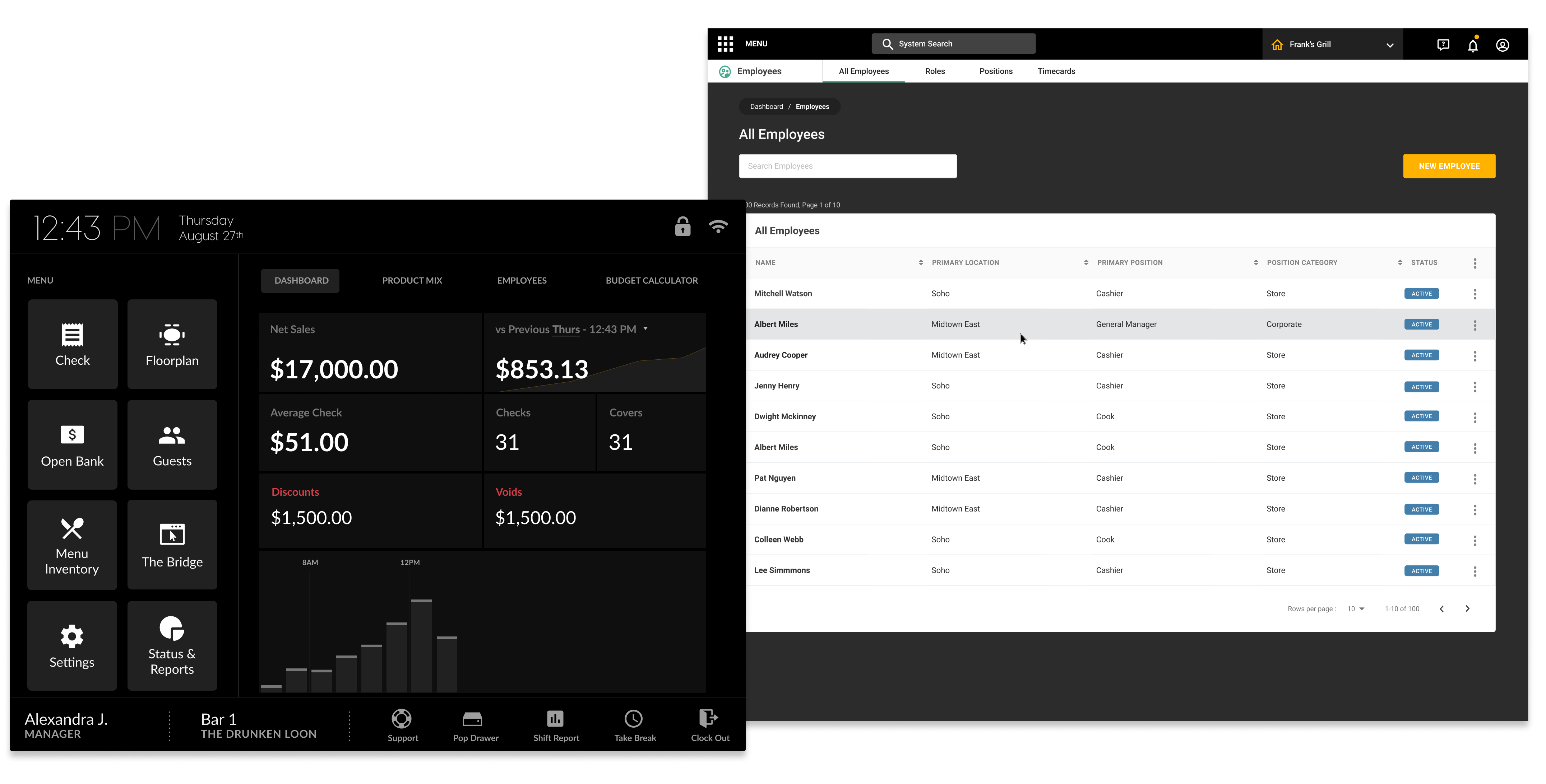
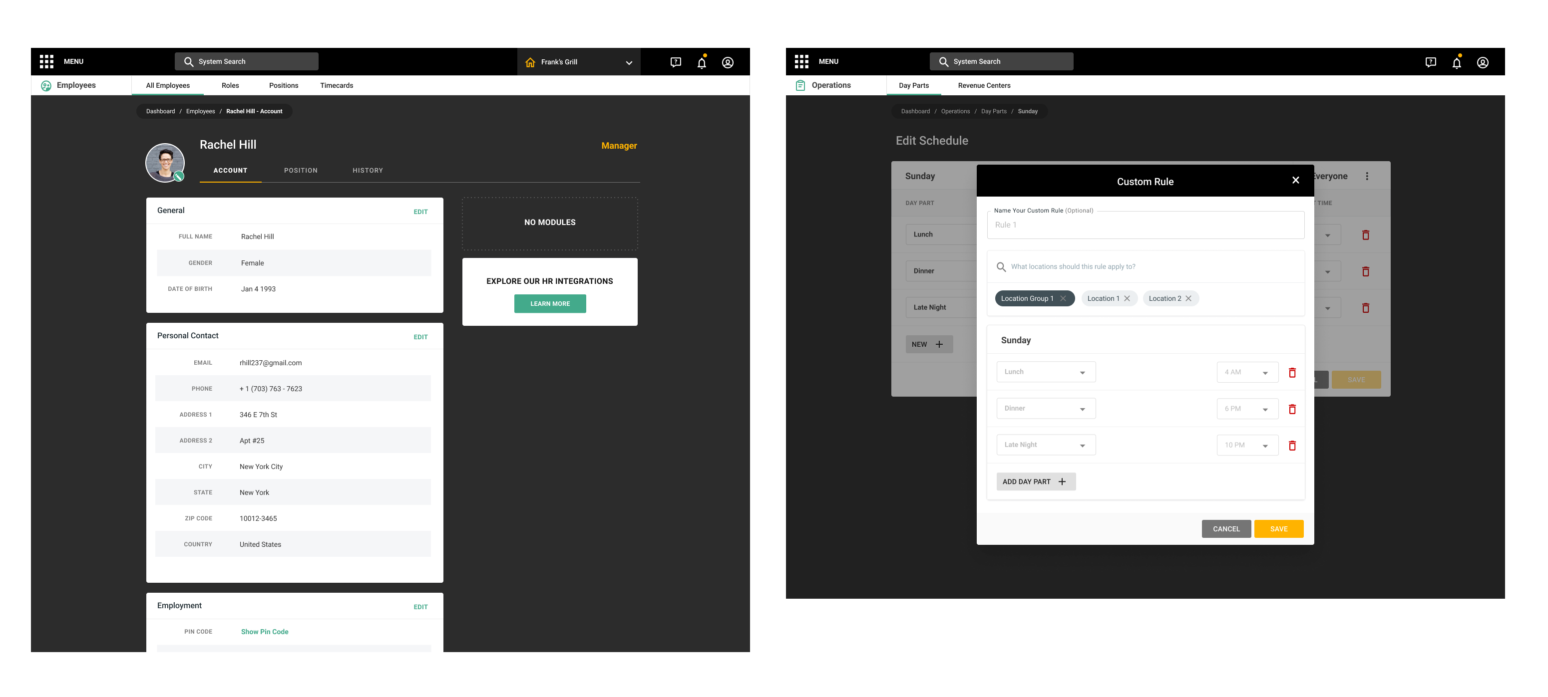
The other core design challenges were addressed largely by using our component library(thanks design system!) to lay out all of the standard operation tools for the web-based Ops Dashboard. The team realized how much easier a revamp would be with a set of visual guidelines to follow. This time around it was possible to mock up anything from advanced data tables to account profiles in minutes because of our handy pre-built library of assets. I was able to keep every element consistent with not only the web app but the entire product suite as a whole.
I also introduced an optional dark theme for operators using their Ops Dashboard onsite during evening business hours where light is typically dim.
DELIVERY
When looking at the delivery of this project, although there was a mountain of design debt to sort through, the clear obstacle was that the design process needed more structure and lacked a repository of approved design elements. Many of the UI rework needed on both mobile and web stemmed from a lack of design unity informing the high-level decisions. With structure being established via a system, building out the newer UI and fixing inconsistencies came much quicker and was less stressful for the SALIDO team.
Working on a new project?
I want to be involved